Our verdict
basement.studio: our verdict
The wireframe room makes the studio’s craft tangible before a visitor reads a pitch. Its architectural identity is memorable, but the opening asks visitors to explore before explaining the offer.
Studios / An independent selection
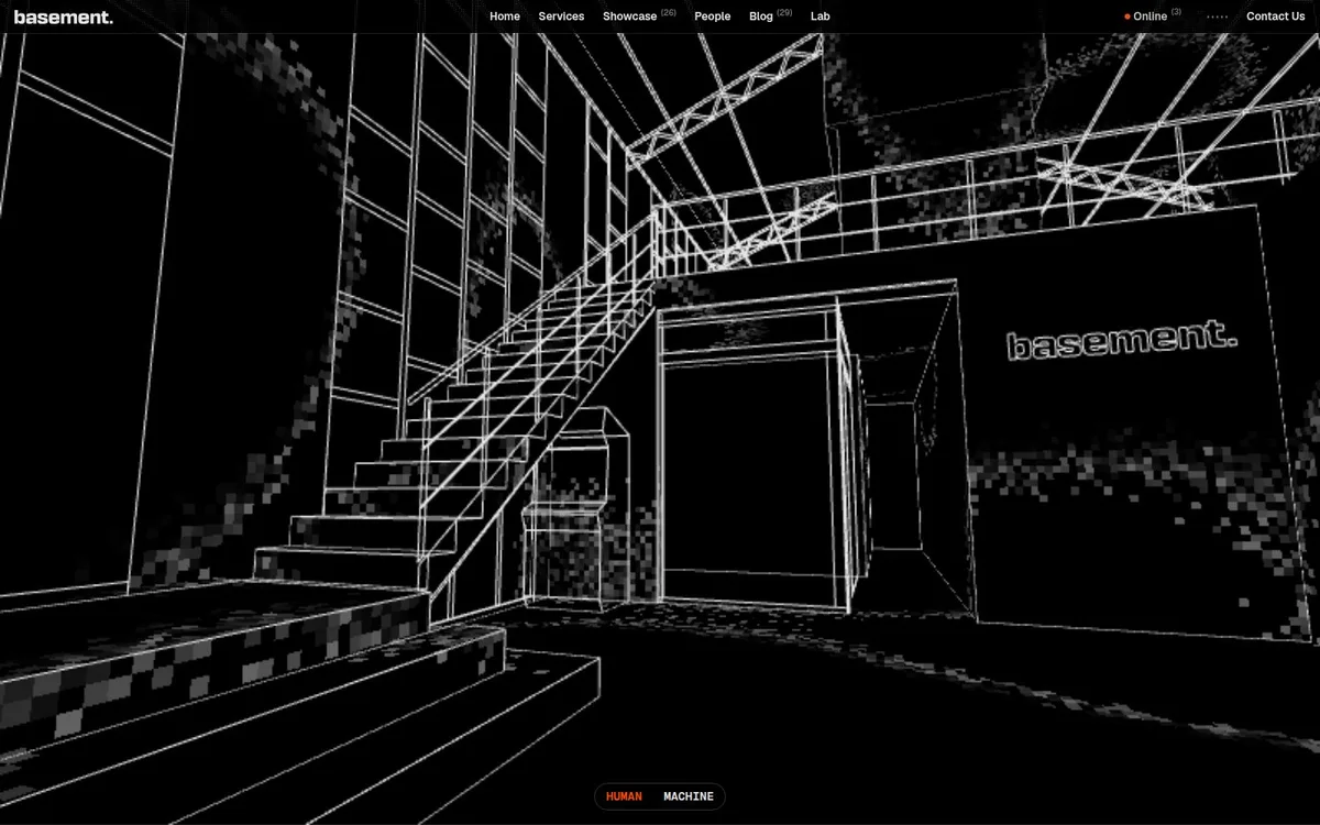
A wireframe architectural scene makes the studio’s technical craft the opening experience.
Original website by basement.studio (opens a new tab)
Reviewed
Independent design commentary. Inclusion does not imply affiliation, sponsorship or endorsement.
The editorial
Our judgment of the desktop homepage captured on 2026-11-01. Live interactions and other screen sizes may differ.
Our verdict
The wireframe room makes the studio’s craft tangible before a visitor reads a pitch. Its architectural identity is memorable, but the opening asks visitors to explore before explaining the offer.
The staircase, rails and doorway create depth with white lines alone. Repeating that treatment in the basement wordmark makes the environment feel like part of the identity. A conventional navigation bar remains visible above it.
The scene dominates almost the entire opening, while Services, Showcase and Contact Us are small navigation items. There is no prominent service statement or project invitation in the captured hero. A new visitor has to infer what the studio sells and choose their own route.
Give an immersive scene one recognisable visual language and keep ordinary navigation available around it. For a studio still building recognition, add a short service statement and a visible “View our work” or “Start a project” action beside the experience.
The field notes
Specific observations from the captured homepage, one design choice at a time.
White wireframe lines build an architectural scene across a black canvas. A compact navigation bar and small central controls leave most of the opening to the environment.
Type is deliberately subordinate to the scene: the wordmark, navigation and controls stay small. The site’s fuller studio positioning is available in its rendered text content.
The human/machine control gives the scene an explicit interaction cue. The captured image shows one state; it does not establish animation smoothness or how the experience behaves on every device.
The page combines an immersive opening with project and service content. Because this excerpt is scene-led, a separate keyboard and reduced-motion review would be needed before treating it as an accessibility reference.
The homepage behaves like an environment to explore rather than a conventional stack of cards. The spatial identity fits a studio presenting design and technical production together.
Review scope: performance, keyboard access, reduced-motion behaviour and mobile interactions have not been tested for this feature. Credits or screenshot need correcting? Request a correction or removal
Part of the collection
An optional badge linking to this editorial feature. It recognises inclusion, not a measured quality score.
Made with Wolfitway
A clear offer. A distinctive identity. A page built around your business.
Landing pages · €999 Back to the collection