Our verdict
Cursor: our verdict
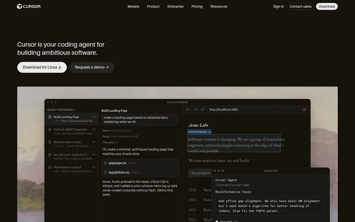
The software takes priority over a large marketing headline. This makes the product central to the story, although the amount of interface detail is hard to absorb at the size shown.
Technology / An independent selection
Warm near-black surfaces put a working coding interface ahead of visual spectacle.
Original website by Cursor (opens a new tab)
Reviewed
Independent design commentary. Inclusion does not imply affiliation, sponsorship or endorsement.
The editorial
Our judgment of the desktop homepage captured on 2026-11-01. Live interactions and other screen sizes may differ.
Our verdict
The software takes priority over a large marketing headline. This makes the product central to the story, although the amount of interface detail is hard to absorb at the size shown.
The compact product statement sits directly above a platform-specific download and a demo route. Warm near-black surfaces connect the page to the editor, while the lighter image behind it separates the demonstration from the surrounding canvas.
Overlapping editor and terminal windows add several simultaneous reading areas. Much of that text is too small to study comfortably in this capture, so the visual establishes breadth more readily than one understandable action.
Let the interface occupy substantial space when it is the best explanation of the product. Focus the demonstration on one task, with a short caption identifying the useful change rather than expecting visitors to read every panel.
The field notes
Specific observations from the captured homepage, one design choice at a time.
A warm near-black canvas frames a large editor demonstration. The restrained colour treatment makes the product’s interface and the image behind it the main source of detail.
The opening statement stays relatively compact instead of becoming an oversized display headline. A rounded download action and a quieter demo link establish the next reading level.
The product demonstration is the natural place for activity. The composition still identifies the product and its next action when the example interface is paused.
The homepage presents a platform-specific download alongside a demo request. The dark variant shown here follows the site’s own appearance preference; framework and performance claims remain unassessed.
The page lets the software occupy more visual space than the marketing headline. That is a useful choice when the interaction model is part of what needs explaining.
Review scope: performance, keyboard access, reduced-motion behaviour and mobile interactions have not been tested for this feature. Credits or screenshot need correcting? Request a correction or removal
Part of the collection
An optional badge linking to this editorial feature. It recognises inclusion, not a measured quality score.
Made with Wolfitway
A clear offer. A distinctive identity. A page built around your business.
Landing pages · €999 Back to the collection