Our verdict
Framer: our verdict
The product demonstration supplies the visual drama while the heading and signup remain readable above it. The opening clearly names the category, though it spends more words on positioning than on a concrete result.
SaaS / An independent selection
A dark stage makes the website-building interface the visual event.
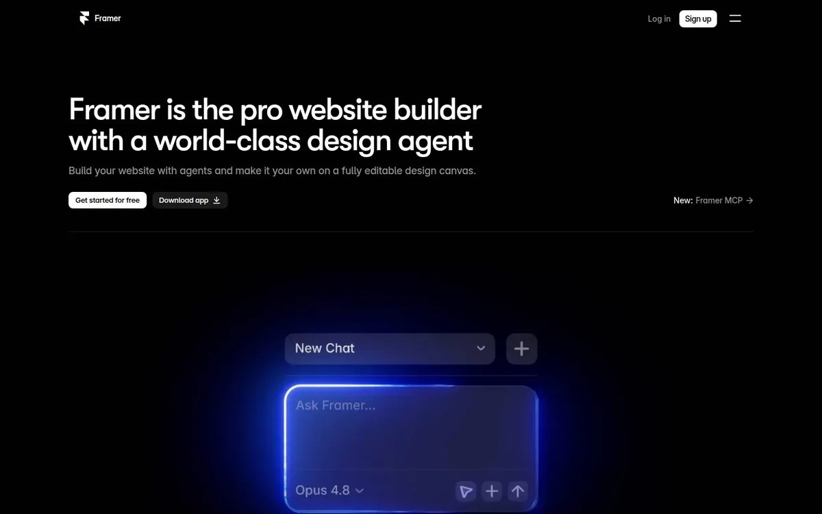
Original website by Framer (opens a new tab)
Reviewed
Independent design commentary. Inclusion does not imply affiliation, sponsorship or endorsement.
The editorial
Our judgment of the desktop homepage captured on 2026-11-01. Live interactions and other screen sizes may differ.
Our verdict
The product demonstration supplies the visual drama while the heading and signup remain readable above it. The opening clearly names the category, though it spends more words on positioning than on a concrete result.
The website-builder description, supporting sentence and free-start button sit in one left-aligned group. The blue glow is concentrated around the product input below, linking the visual treatment to a tool visitors could use.
The two-line heading combines a product category with self-praise about its design agent. The large prompt interface is cropped by the bottom of the capture, so the opening shows where to start typing more clearly than what the finished website could look like.
Keep the action outside the demonstration so it remains easy to find. Show an input alongside a small finished result, and replace a broad quality claim with a specific outcome the visitor can recognise.
The field notes
Specific observations from the captured homepage, one design choice at a time.
The black canvas leaves generous space around a left-aligned headline, with a glowing product interface below. The bright interface treatment creates a clear point of attention.
The headline uses a compact sans-serif block with a smaller explanatory sentence underneath. Its plain hierarchy leaves the more expressive visual treatment to the product demonstration.
The opening introduces the product through an interface scene. The transferable idea is to keep the core action and explanation visible while the demonstration supplies movement and texture.
Signup and app-download paths are both visible in the opening. The screenshot records the rendered homepage; it is not evidence of the underlying framework or measured runtime performance.
The interface becomes the illustration. That makes the visual directly relevant to what visitors would use, rather than relying on an unrelated decorative object.
Review scope: performance, keyboard access, reduced-motion behaviour and mobile interactions have not been tested for this feature. Credits or screenshot need correcting? Request a correction or removal
Part of the collection
An optional badge linking to this editorial feature. It recognises inclusion, not a measured quality score.
Made with Wolfitway
A clear offer. A distinctive identity. A page built around your business.
Landing pages · €999 Back to the collection