Our verdict
Linear: our verdict
The product interface provides concrete evidence beneath a calm, legible promise. The restraint makes the workflow credible, although the first screen gives much more space to demonstration than to a next step.
SaaS / An independent selection
A restrained product page that lets the interface do the convincing.
Original website by Linear (opens a new tab)
Reviewed
Independent design commentary. Inclusion does not imply affiliation, sponsorship or endorsement.
The editorial
Our judgment of the desktop homepage captured on 2026-11-01. Live interactions and other screen sizes may differ.
Our verdict
The product interface provides concrete evidence beneath a calm, legible promise. The restraint makes the workflow credible, although the first screen gives much more space to demonstration than to a next step.
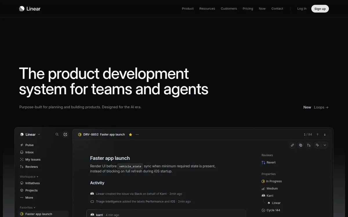
The large left-aligned headline and issue-detail preview share a clear reading direction. Showing a named task, status and activity makes the software’s purpose easier to understand than an abstract illustration would.
The obvious signup action sits in the top navigation, away from the main promise. The interface preview also contains dense, small text: as a hero image it conveys realism more readily than it teaches the workflow.
Use a real, recognisable task as visual proof, with one focal area in the interface. Keep the calm spacing, then place a primary action next to the promise so the visitor can act without returning to the navigation.
The field notes
Specific observations from the captured homepage, one design choice at a time.
A nearly black canvas, quiet navigation and a large left-aligned headline give the product interface room to breathe. The app preview occupies the lower half of the opening screen.
Large sentence-case sans-serif type leads the page; muted supporting text and compact interface labels create a clear second and third reading level.
The product scene suggests a working interface rather than an ornamental background. The useful lesson is to keep the product story understandable even when its animation is frozen.
The captured page exposes product content and account entry points in its rendered markup. This review studies the presentation; it does not certify load speed, keyboard access or contrast.
The visual language of the marketing page closely matches the product it introduces. Its authority comes from showing a concrete workflow rather than adding unrelated spectacle.
Review scope: performance, keyboard access, reduced-motion behaviour and mobile interactions have not been tested for this feature. Credits or screenshot need correcting? Request a correction or removal
Part of the collection
An optional badge linking to this editorial feature. It recognises inclusion, not a measured quality score.
Made with Wolfitway
A clear offer. A distinctive identity. A page built around your business.
Landing pages · €999 Back to the collection