Our verdict
Metalab: our verdict
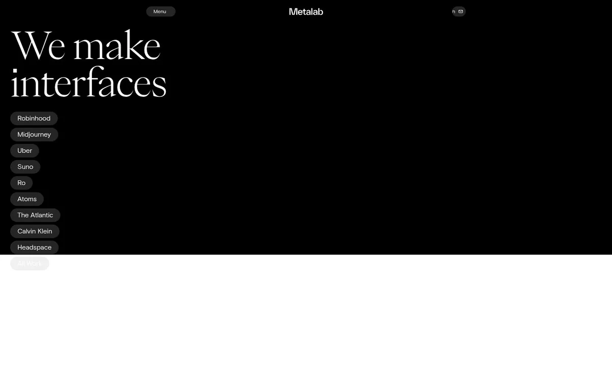
The oversized serif statement and compact client names make a confident introduction. The sparse opening depends heavily on the visitor recognising those clients and choosing to investigate further.
Studios / An independent selection
An expressive serif statement gives a product studio a confident, sparse opening.
Original website by Metalab (opens a new tab)
Reviewed
Independent design commentary. Inclusion does not imply affiliation, sponsorship or endorsement.
The editorial
Our judgment of the desktop homepage captured on 2026-11-01. Live interactions and other screen sizes may differ.
Our verdict
The oversized serif statement and compact client names make a confident introduction. The sparse opening depends heavily on the visitor recognising those clients and choosing to investigate further.
The large serif type has a recognisable voice against a near-empty black canvas. A compact column of client names places evidence directly beside the positioning rather than burying it in a later section.
The statement says what the studio makes but not who it helps or what changes for a client. Most of the captured right side is empty, while work and contact routes receive much less emphasis than the type.
Combine a distinctive type voice with concise proof. If the studio is less familiar, use some of the empty space for one project preview and a clearly labelled route into the work or an enquiry.
The field notes
Specific observations from the captured homepage, one design choice at a time.
A black opening, a small centred wordmark and a large statement at the left make a deliberately sparse first impression. Compact client-name pills sit directly beneath the headline.
The oversized serif headline contrasts with small utilitarian labels. Its thin strokes and generous line spacing give the statement a different texture from the surrounding controls.
The studio’s homepage exposes hover and drag cues in its content. The static excerpt here records the opening layout, rather than claiming to demonstrate every interaction.
The public homepage describes interface work and presents a client-led way into its portfolio. This editorial note does not infer its implementation framework or quantify the effectiveness of its interactions.
The studio’s positioning is expressed in very few elements. The combination of a distinctive type voice and compact proof makes restraint itself part of the identity.
Review scope: performance, keyboard access, reduced-motion behaviour and mobile interactions have not been tested for this feature. Credits or screenshot need correcting? Request a correction or removal
Part of the collection
An optional badge linking to this editorial feature. It recognises inclusion, not a measured quality score.
Made with Wolfitway
A clear offer. A distinctive identity. A page built around your business.
Landing pages · €999 Back to the collection