Our verdict
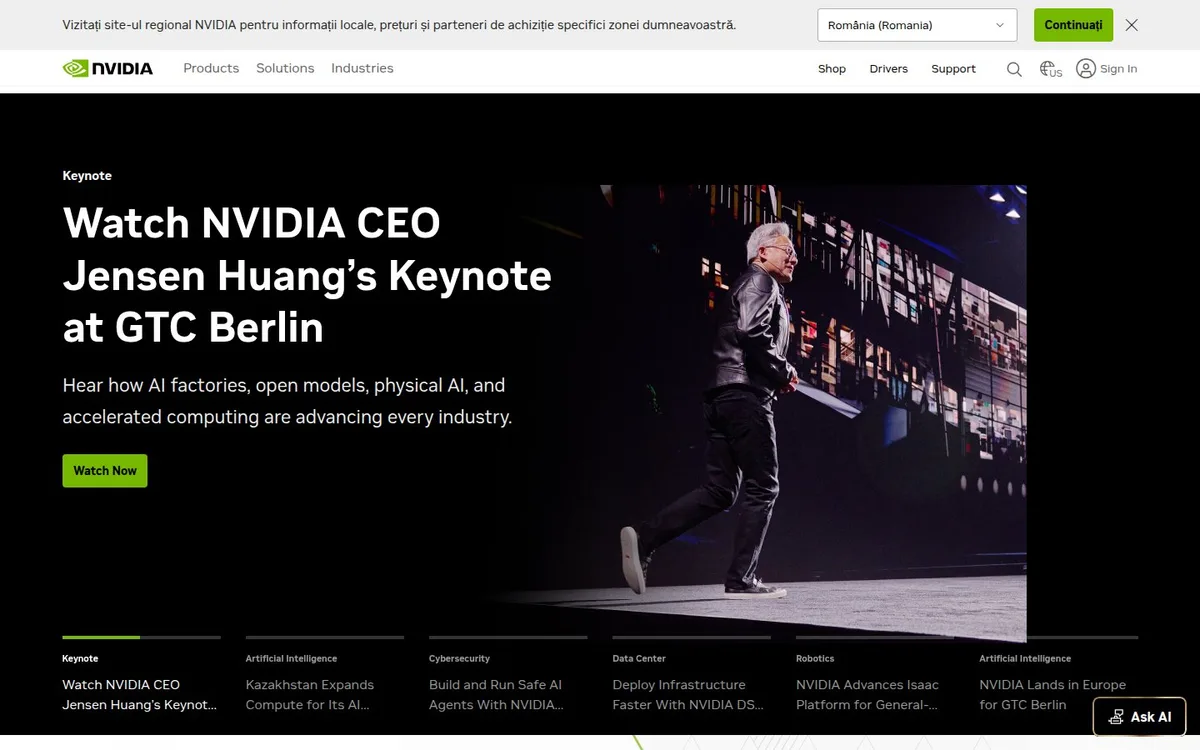
One event receives the strongest headline, image and action, while a preview strip keeps other stories available. It is a useful editorial hierarchy, though the surrounding interface makes the first screen busy.
Hero sections / Editorial selection
A dark editorial hero gives a technology giant a clear event-led opening.
Original website NVIDIA (opens a new tab)
Editorial review:
Independent design commentary. Inclusion does not imply affiliation, sponsorship or endorsement.
Wolfitway / Design critique
Based on the desktop homepage captured on 2026-11-01. Our design judgment covers this opening view; live interactions and other screen sizes may differ.
One event receives the strongest headline, image and action, while a preview strip keeps other stories available. It is a useful editorial hierarchy, though the surrounding interface makes the first screen busy.
The left-hand headline and right-hand stage photograph establish a clear lead story. A bright green viewing action is easy to distinguish, and the smaller story previews indicate that more topics are available without giving each a full hero.
The regional notice, global navigation, story strip and floating assistant all surround the lead story. Several preview titles are truncated in the captured view, limiting how well the strip helps visitors compare destinations.
Choose one current story and give it a decisive headline, image and action. Keep secondary previews concise enough to remain readable, and check how utility banners change the space available for the hero.
Design commentary / Homepage capture
01
A black hero places a large event headline beside a stage photograph. The green action and progress marker provide the principal colour accents within that section.
02
The headline has the visual weight of a news lead. Smaller category labels and compact story previews below it separate the current feature from the next topics.
03
The numbered story strip gives the hero a visible sequence. This capture records one selected story, so its lesson is the navigation structure rather than any claimed animation smoothness.
04
This selection studies the dark hero section, not an entirely dark website: the global header and surrounding sections use lighter surfaces. Regional notices can also change the first view.
05
A large product ecosystem is reduced to one current story at the top. The adjacent previews make the breadth available without giving every topic equal headline weight.
Review scope: these notes discuss the captured homepage. Performance, keyboard access, reduced-motion behaviour and mobile interactions have not been tested for this feature. Credits or screenshot need correcting? Request a correction or removal.
An optional badge linking to this editorial feature. It recognises inclusion, not a measured quality score.
Build with Wolfitway
Bring the ambition. We’ll shape the offer, visual identity and page around your business.
Landing pages · €2,500Keep exploring the collection →