Our verdict
Raycast: our verdict
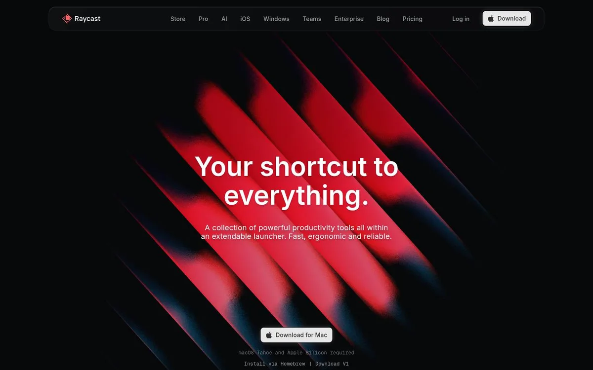
A concentrated red form gives a familiar productivity offer a strong visual signature. The download is easy to find, but the broad headline needs its smaller explanation to establish what the product actually is.
SaaS / An independent selection
A sculptural red centrepiece turns a compact promise into a distinctive hero.
Original website by Raycast (opens a new tab)
Reviewed
Independent design commentary. Inclusion does not imply affiliation, sponsorship or endorsement.
The editorial
Our judgment of the desktop homepage captured on 2026-11-01. Live interactions and other screen sizes may differ.
Our verdict
A concentrated red form gives a familiar productivity offer a strong visual signature. The download is easy to find, but the broad headline needs its smaller explanation to establish what the product actually is.
The diagonal red forms frame the white headline rather than spreading colour across every element. A bright Mac download button gives the dense composition a clear destination, with platform requirements immediately below.
The headline promises a shortcut to everything without naming the product category. The launcher explanation and installation details are much smaller, so the visitor must read beyond the strongest visual element to understand fit.
Choose one bold visual motif and repeat a clear primary action. Pair an expressive headline with an equally easy-to-read category description; keep platform requirements close to the download.
The field notes
Specific observations from the captured homepage, one design choice at a time.
A diagonal red sculptural form surrounds the centred headline. The black background keeps the colour concentrated around the message rather than distributing it across the whole interface.
The compact two-line headline sits above a short explanation. Navigation stays small, leaving the main promise and the download action as the strongest reading anchors.
The dimensional artwork gives a sense of movement within a still frame. Preserve that strong silhouette when studying how motion can support, rather than replace, a readable composition.
The opening includes a platform-specific download action and installation details beneath it. Those details help someone understand the next step without hiding essential information behind an effect.
The red form creates an identifiable signature without using a screenshot as the hero. The product explanation remains close enough to keep the abstraction grounded.
Review scope: performance, keyboard access, reduced-motion behaviour and mobile interactions have not been tested for this feature. Credits or screenshot need correcting? Request a correction or removal
Part of the collection
An optional badge linking to this editorial feature. It recognises inclusion, not a measured quality score.
Made with Wolfitway
A clear offer. A distinctive identity. A page built around your business.
Landing pages · €999 Back to the collection