Our verdict
Resend: our verdict
Expressive type gives a technical service a human voice without making its purpose obscure. The quiet composition is distinctive, although the captured opening gives little concrete product proof.
SaaS / An independent selection
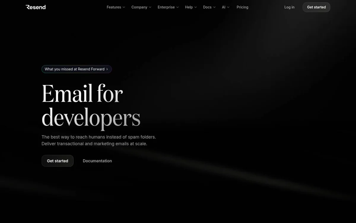
An editorial serif headline brings a human tone to developer infrastructure.
Original website by Resend (opens a new tab)
Reviewed
Independent design commentary. Inclusion does not imply affiliation, sponsorship or endorsement.
The editorial
Our judgment of the desktop homepage captured on 2026-11-01. Live interactions and other screen sizes may differ.
Our verdict
Expressive type gives a technical service a human voice without making its purpose obscure. The quiet composition is distinctive, although the captured opening gives little concrete product proof.
The large serif headline names both the service and audience. Get started and Documentation offer two sensible routes below the explanation, while the largely empty right side protects the reading hierarchy.
The opening relies on a broad delivery claim rather than showing an email, code example or result. The muted explanatory text and restrained button treatment give supporting information less visual presence than the headline.
Let typography carry identity when the offer can be stated plainly. Keep signup and documentation together, then add a compact example that substantiates the promise without filling every empty area.
The field notes
Specific observations from the captured homepage, one design choice at a time.
Almost the entire canvas stays black. A restrained pool of light sits beside the text, creating depth without competing with the offer or the two actions below it.
The large serif headline contrasts with the small sans-serif navigation and supporting copy. That pairing gives a technical service an unusually editorial voice.
The still composition carries the message without requiring an animation to explain it. The lesson is to establish hierarchy first, then use any ambient movement as a secondary layer.
The page places a signup path beside documentation, giving first-time evaluators and developers different routes forward. No framework, speed or accessibility score is inferred from this layout.
The design avoids the usual wall of dashboard screenshots in its opening. A narrow palette and expressive typography make a straightforward developer offer feel distinctive.
Review scope: performance, keyboard access, reduced-motion behaviour and mobile interactions have not been tested for this feature. Credits or screenshot need correcting? Request a correction or removal
Part of the collection
An optional badge linking to this editorial feature. It recognises inclusion, not a measured quality score.
Made with Wolfitway
A clear offer. A distinctive identity. A page built around your business.
Landing pages · €999 Back to the collection