Our verdict
Supabase: our verdict
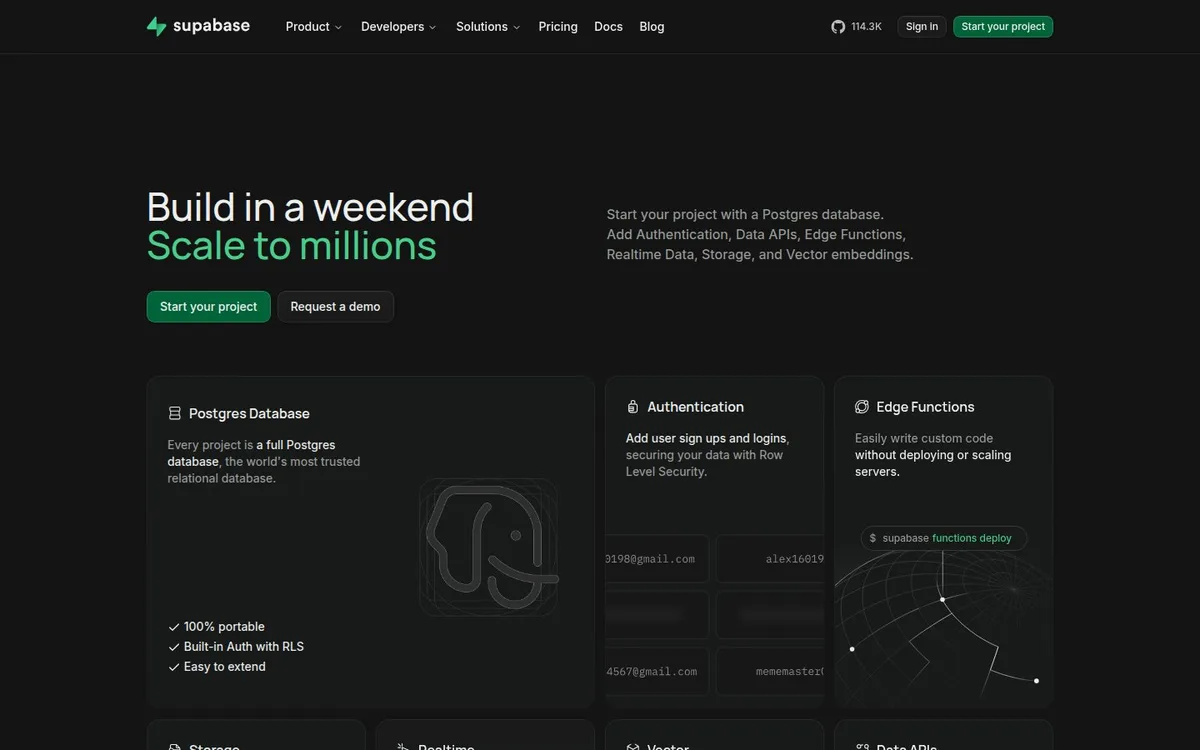
A consistent green accent and modular cards make a broad technical platform feel coherent. The same completeness creates a dense opening that asks visitors to process several products at once.
Technology / An independent selection
A green accent and a disciplined card system make a broad platform legible.
Original website by Supabase (opens a new tab)
Reviewed
Independent design commentary. Inclusion does not imply affiliation, sponsorship or endorsement.
The editorial
Our judgment of the desktop homepage captured on 2026-11-01. Live interactions and other screen sizes may differ.
Our verdict
A consistent green accent and modular cards make a broad technical platform feel coherent. The same completeness creates a dense opening that asks visitors to process several products at once.
The two-line promise pairs speed with scale, and the green primary action repeats the headline emphasis. Named database, authentication and function cards break the platform into recognisable parts.
The explanation, two actions and several detailed cards compete within the first screen. The supporting paragraph carries a long list of capabilities, giving a newcomer few clues about which capability to investigate first.
Use one accent to connect the promise and next action, then organise capabilities into consistent cards. Lead with one recommended starting point before expanding into the full platform.
The field notes
Specific observations from the captured homepage, one design choice at a time.
The dark appearance uses green sparingly: in the wordmark, a headline emphasis and the primary action. The darker product cards give a broad technical offer a structured opening.
The headline splits its promise across two lines, with colour distinguishing the second. Supporting explanation sits alongside it instead of extending the heading into a paragraph.
The product cards communicate through labels and diagrams in the still capture. Their organisation is worth studying before adding animation to individual features.
The page exposes distinct database, authentication and function entry points. This capture uses its supported dark colour scheme; no claim about the performance of those services is made.
A large platform is introduced as a coherent set of parts. Repeated card geometry and a shared accent colour help the product family read as one system.
Review scope: performance, keyboard access, reduced-motion behaviour and mobile interactions have not been tested for this feature. Credits or screenshot need correcting? Request a correction or removal
Part of the collection
An optional badge linking to this editorial feature. It recognises inclusion, not a measured quality score.
Made with Wolfitway
A clear offer. A distinctive identity. A page built around your business.
Landing pages · €999 Back to the collection