Our verdict
Vercel: our verdict
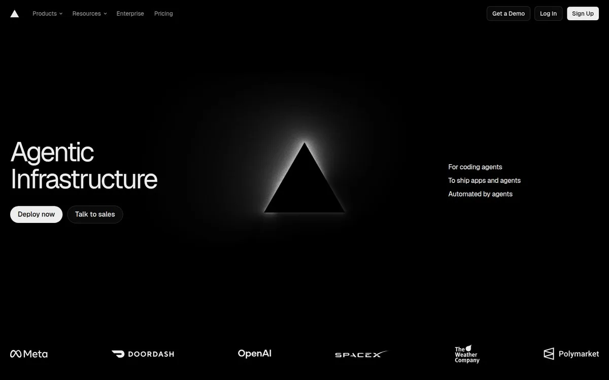
The illuminated triangle turns a simple brand symbol into the hero’s focal point. The layout feels assured, but the abstract language and widely separated text assume some familiarity with the offer.
Technology / An independent selection
A familiar triangle becomes the organising idea of a monochrome dark hero.
Original website by Vercel (opens a new tab)
Reviewed
Independent design commentary. Inclusion does not imply affiliation, sponsorship or endorsement.
The editorial
Our judgment of the desktop homepage captured on 2026-11-01. Live interactions and other screen sizes may differ.
Our verdict
The illuminated triangle turns a simple brand symbol into the hero’s focal point. The layout feels assured, but the abstract language and widely separated text assume some familiarity with the offer.
The central triangle connects the small navigation mark to a much larger visual identity. A row of customer logos supplies a distinct proof layer, and the bright deployment action stands out against the black canvas.
The headline on the left and explanatory lines on the right require a visitor to connect distant pieces of the message. Neither the symbol nor the broad infrastructure wording shows a concrete workflow in the captured opening.
Enlarge a meaningful brand shape rather than adding unrelated artwork. Keep the customer proof, but bring a plain-language explanation and a small product example closer to the main action when addressing newcomers.
The field notes
Specific observations from the captured homepage, one design choice at a time.
The dark appearance places a softly illuminated triangle between the main headline and a compact supporting statement. A row of customer logos grounds the otherwise sparse composition.
The headline is short, left-aligned and broken into two lines. Smaller supporting copy sits across the canvas, using distance and scale to separate the reading levels.
The central mark is recognisable in the captured still. When studying an animated brand symbol, check that its static state retains a clear shape and does not obscure the message.
This capture uses the website’s own dark colour-scheme preference. The page offers deployment and sales paths; this is an appearance review, not an infrastructure benchmark.
The brand symbol does the work of a much larger illustration. Keeping the palette monochrome lets geometry, spacing and light carry the identity.
Review scope: performance, keyboard access, reduced-motion behaviour and mobile interactions have not been tested for this feature. Credits or screenshot need correcting? Request a correction or removal
Part of the collection
An optional badge linking to this editorial feature. It recognises inclusion, not a measured quality score.
Made with Wolfitway
A clear offer. A distinctive identity. A page built around your business.
Landing pages · €999 Back to the collection