We Tested 379 Company Homepages for Accessibility. 9 Passed.
The European Accessibility Act has applied since 28 June 2025. Online shops, banks, transport companies, e-book sellers and a few other sectors in the EU now have a legal duty to make their websites usable for people with disabilities. I wanted to know how far the average company actually is from that, so I tested homepages.
Over three weeks I ran the same automated accessibility test on the homepages of 379 companies. 279 were small and mid-size companies and startups. 100 were the biggest listed companies in the world.
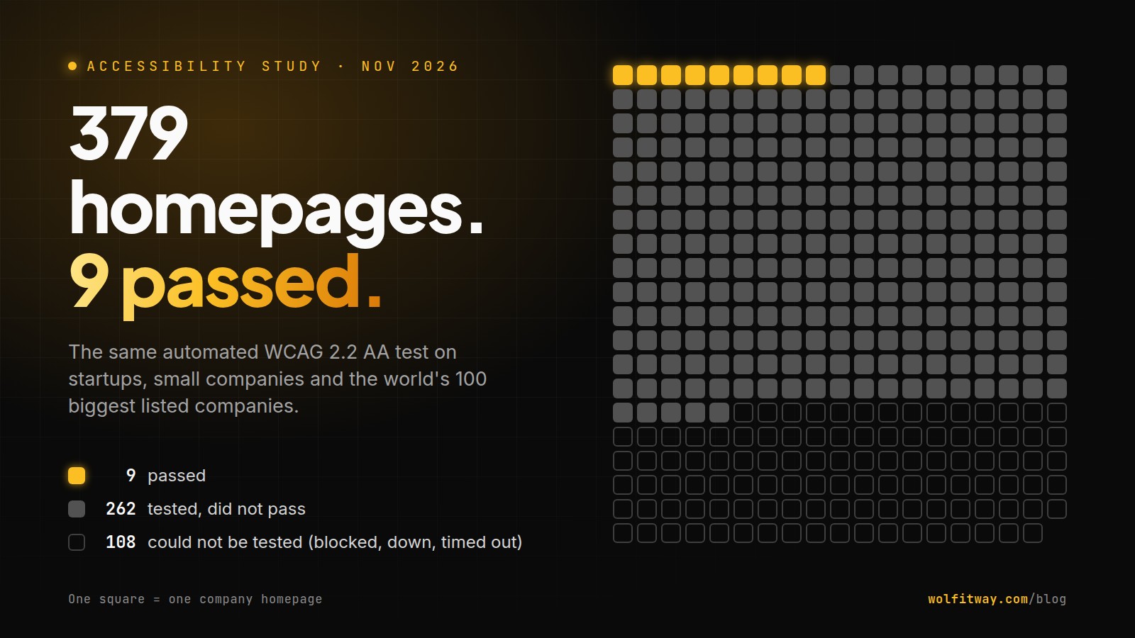
The headline: of the 271 homepages I could actually test, 9 passed. Eight small companies and one giant (Shell).
This article is mostly about how I got that number, because a number like that is only worth something if you can see how it was made. You will find who was in the sample, how many sites blocked me, what the test checks and what it can't check, how the score works, and the problems that showed up again and again. At the end there is a short list of fixes that would move most sites over the line.
One disclosure first. I build websites and landing pages for a living, and the 279 smaller companies came from my own list of possible clients. That's why I had their addresses. It's also why I've kept the method strict and published every rule below: you shouldn't have to trust me, you should be able to check me.
The short version
- 379 homepages tried. 271 tested. 108 couldn't be tested (mostly security walls that block automated visitors). Blocked sites are left out. They don't count as fails.
- Smaller companies: 8 of 209 passed (3.8%). Average score 61 out of 100, median 67.
- The world's 100 biggest listed companies: 1 of 62 passed (1.6%). Average score 53, median 56.5.
- Low-contrast text was the most common problem by far: 86% of the smaller companies' homepages and 56 of 62 of the big ones (90%).
- 45 of the smaller companies were one failing rule away from passing. Most of these rules are a few lines of CSS or one missing label.
- This is an automated test of one page per company. A pass is a good sign. It is not a certificate, and it doesn't make a site "compliant".
Why test homepages at all
A homepage is the one page every company has, and the one every visitor sees first. If someone using a screen reader can't tell what a button does on the homepage, or someone with low vision can't read the main headline, they often never get to the product page.
It's also the fairest thing to compare. Checkout flows, account areas and support pages differ a lot between a bank and a SaaS startup. A homepage is a homepage.
The downside is obvious: one page says little about a whole website. I'll come back to that in the limits section. Keep it in mind for every number here.
Who was in the sample
I kept two groups, and I report them apart. They are very different companies, and mixing them would hide that. (I made that mistake once in my own working notes, and the totals came out wrong. Since then the two groups never share a table.)
Group 1: 279 smaller companies and startups
These came from public listings I use to find clients:
| Source | Companies |
|---|---|
| Wikidata (companies registered in Germany, the UK, the Netherlands and Romania) | 159 |
| BetaList (new startups) | 35 |
| Y Combinator company directory | 26 |
| Show HN on Hacker News | 22 |
| Hacker News "Who is hiring?" | 20 |
| Remote OK job listings | 12 |
| Added by hand | 5 |
My full list had 498 companies. 98 of them were also in Group 2, so I took them out here. Another 121 I had already ruled out as clients for sales reasons, before any scan was run, and I never scanned them. That leaves 279, and every one of them was tried. I didn't pick which ones to report after seeing results.
Of the 209 I could test, the countries I could identify were Romania (44), the UK (26), Germany (24), the US (21), the Netherlands (17), Japan (1) and Canada (1). For 75 I don't have a country on record.
Group 1 is not a random sample of all businesses. It leans towards tech companies and startups, and towards the four European countries I pulled from Wikidata. Treat it as "a few hundred real small and mid-size company websites", not as "the average European business".
Group 2: the 100 biggest listed companies in the world
I took the top 100 companies by market value from CompaniesMarketCap and saved the ranking on 2 November 2026, before scanning anything. Market value changes every day, so the saved copy (with a hash of the source pages) is what the study uses.
The rule was simple: the list was fixed in advance. No swapping a company for an easier one, no second tries to get a nicer result, no replacing a blocked company with the next one down. When a company has several websites, I used the main corporate or main consumer homepage and wrote down which one (for example abc.xyz for Alphabet and about.meta.com for Meta).
Not every site let me in

This part gets left out of most studies, so here it is in full.
An automated test runs from a server, not from someone's laptop. A lot of websites block that on purpose. Bot protection services (Cloudflare and similar) show a challenge page instead of the real site. Others limit how often a server can visit, or just never answer.
Group 1: I could test 209 of 279 (75%).
| Why I couldn't test it | Sites |
|---|---|
| Security challenge or firewall | 32 |
| Rate limited (too many requests, HTTP 429) | 4 |
| Unreachable (no answer, DNS failure, site down) | 23 |
| Scan error, timeout, interrupted, HTTP 400/401 | 11 |
| Total | 70 |
Group 2: I could test 62 of 100.
| Why I couldn't test it | Sites |
|---|---|
| Security challenge, firewall or gate page | 14 |
| Page took more than 20 seconds to load | 10 |
| Unreachable | 9 |
| Other (scan failed, HTTP 400, interrupted, only a regional shell page loaded) | 5 |
| Total | 38 |
Big companies were harder to get into (38% couldn't be tested, against 25% of the smaller group). NVIDIA, Microsoft, Alphabet, Amazon, Tesla, Meta and Walmart are among the 38. For the record: when the page I got back was a challenge or a "click to continue" screen rather than the real homepage, I threw the result out, even if the score looked fine. Amazon is one of those. I checked the captured titles, headings and screenshots of the big companies by hand to catch this.
A blocked site is never counted as a fail. It's simply not in the results. So all the pass rates below are out of the sites I could test (209 and 62), not out of everyone I tried (279 and 100). If you quote this study, please quote both.
There is a real question hiding in here too. If a server can't get past the front door, some assistive tools and some privacy browsers may have trouble too. I didn't test that, so I won't claim it. But it's worth a look if you run one of those walls.
How the test works

Every site got exactly the same test, run by the same scanner on the same server.
One page, two screen sizes. The scanner opens the homepage in a fresh Chromium browser twice: once at desktop size (1440 x 900) and once at phone size (390 x 844). The phone run uses Chrome's mobile mode, not a real iPhone with Safari. Problems found at either size are merged into one report.
Cookie banners. Most sites show a consent banner first. The scanner tries to close it the way a visitor would, then tests the page underneath. When it can't, the banner stays and gets tested as part of the page, which is fair, since a visitor sees it too.
The rules: axe-core plus a pixel check. The main engine is axe-core 4.14, the open-source accessibility engine used inside many testing tools and browser extensions. I ran it with the rules for WCAG 2.0, 2.1 and 2.2 at levels A and AA. WCAG (Web Content Accessibility Guidelines) is the standard that EU rules point to. The EU standard behind the Accessibility Act, EN 301 549, is built on WCAG level AA.
axe-core has one known blind spot: text on top of a photo, a gradient or a video. It can't work out the background colour, so it marks those "needs review" and moves on. On modern homepages that's often the biggest headline on the page. So the scanner has a second check: it takes a screenshot of the element with the text hidden, reads the actual background pixels, and compares them with the text colour. It uses the 5th-worst percentile of the background, so a single dark pixel doesn't fail a light button, but white text running across a bright part of a photo does.
Three groups of findings, only one counts. Every finding lands in one of three buckets:
- WCAG failures. Confirmed breaks of a WCAG A or AA rule. Only these count toward the score and the pass/fail.
- Needs review. Things a human should double-check, like contrast the scanner couldn't measure.
- Advice. Best practices that aren't WCAG rules, like very small text or vague link text ("click here").
Keeping review and advice out of the score means the score only goes down for problems the scanner is sure about.
Time limits. A page gets 20 seconds to load. The whole scan of one site (both screen sizes, all checks) gets four minutes. Two sites were scanned at a time.
How the score works
Each failing WCAG rule takes points off a starting score of 100. How many depends on how serious the problem is, as rated by axe-core:
| Impact | Points off |
|---|---|
| Critical | 15 |
| Serious | 8 |
| Moderate | 3 |
| Minor | 1 |
The penalty grows a little with the number of elements affected, but slowly (it's scaled by the log of the count). One unlabelled button costs 15 points. Ten unlabelled buttons cost 30, not 150. This stops one sloppy menu from sending a page to zero, while still showing that ten problems are worse than one.
To pass, a page needs all three:
- a score of 90 or more,
- zero critical problems,
- zero serious problems.
The last two rules matter. A page with one critical problem on one element scores 85 and fails. But a page could in theory reach 90 with one small serious issue, and I didn't want that to count. Critical and serious problems are the ones that can stop someone using the page, like a button a screen reader announces as just "button", or a headline someone can't read. So any one of those is a fail, whatever the score.
The results

Group 1: smaller companies (209 tested)
- 8 passed (3.8%).
- 45 (21.5%) were one failing rule away: exactly one critical or serious rule stood between them and a pass.
- 72 (34%) had at least one critical problem.
- Average score 61, median 67.
Group 2: the 100 biggest companies (62 tested)
- 1 passed: Shell, with a score of 100. For full transparency: Shell's cookie panel was still showing in the capture, and the score describes the page in that state.
- 8 were one failing rule away.
- 31 (50%) had at least one critical problem.
- Average score 53, median 56.5.
Split by rank, the top 50 went 1 pass out of 26 tested, and ranks 51 to 100 went 0 out of 36.
Big companies did no better
I expected the big companies to win easily. They have accessibility teams, design systems and legal departments. They didn't. 1 in 62 passed, against 8 in 209 for the smaller group. Their average score was lower too (53 against 61).
I want to be careful with this. The groups are different in size, in industry and in country, and the samples are small. I'm not claiming small companies are better at accessibility, or that money doesn't help. What the data does show is narrower and still interesting: a big budget didn't produce a passing homepage either. Size isn't the thing that decides this.
The problems that showed up most

Here is what failed most often in Group 1. These are WCAG failures only, counted once per site.
| Problem | Sites (of 209) |
|---|---|
| Text too faint against its background | 180 (86%) |
| Links with no readable name | 71 (34%) |
| Visible label doesn't match the hidden name | 50 (24%) |
| Tap targets too small on phones | 44 (21%) |
| Images with no text description | 38 (18%) |
| Buttons with no readable name | 28 (13%) |
| Zooming blocked on phones | 26 (12%) |
| Scroll areas you can't reach with a keyboard | 22 (11%) |
Group 2 had nearly the same top five: contrast on 56 of 62, label mismatch on 32, unnamed links on 20, small tap targets on 13, unnamed buttons on 12.
Here is what each one means, and why it matters to a real person.
1. Text too faint against its background (86%)
WCAG asks for a contrast ratio of at least 4.5 to 1 between normal text and its background, and 3 to 1 for large text (24 px, or about 19 px bold). Light grey text on white usually misses. So does white text on a busy photo.
This one is everywhere because it looks good in a design file. Soft grey body text and pale captions feel calm and premium on a bright monitor. On a phone in the sun, on a cheap laptop screen, or for anyone over 50, they are hard to read. Low contrast doesn't only hurt people with a diagnosed visual impairment. It hurts nearly everyone a little.
The fix is usually one line: a darker grey for body text, or a dark overlay behind text that sits on a photo.
2. Links with no readable name (34%)
This is almost always an icon link: a logo in the footer, a social media icon, a "menu" or "search" icon with no text. A screen reader user hears "link" and nothing else. Imagine a page where five buttons all say "link".
The fix is an aria-label ("LinkedIn", "Open menu") or hidden text inside the link.
3. Visible label doesn't match the hidden name (24%)
A button says "Get started", but in the code its hidden name is "Sign up for our free trial today". People who control their computer by voice say what they see: "click Get started". If the hidden name doesn't contain those words, nothing happens.
The fix is to make the hidden name start with the visible text, or remove the hidden name and let the visible text do the job.
4. Tap targets too small on phones (21%)
WCAG 2.2 added a minimum target size: 24 by 24 CSS pixels, or enough space around a smaller target. Tiny footer links and close buttons packed next to each other are the usual problem. For someone with a tremor, or anyone using their thumb on a bus, it means hitting the wrong thing.
The fix is padding. The link can look the same; the tappable area just gets bigger.
5. Images with no text description (18%)
Images that carry meaning (a product photo, a chart, a logo in a "trusted by" row) need alt text so a screen reader can describe them. Without it, a screen reader may read out the file name, like "IMG_4471_final_v2.jpg". Images that are pure decoration should have an empty alt (alt="") so they're skipped.
6. Buttons with no readable name (13%)
The same problem as links, on buttons: a play button, a carousel arrow or a hamburger menu built from an icon with no label. Same fix: an aria-label.
7. Zooming blocked on phones (12%)
A single setting in the page's code (user-scalable=no or a low maximum-scale in the viewport tag) stops people from pinch-zooming. People with low vision rely on zoom. Removing that setting is a one-line change and almost never breaks anything.
8. Scroll areas you can't reach with a keyboard (11%)
A box with its own scroll bar (a long list, a code sample, a horizontal row of cards) that can't get keyboard focus. Someone who can't use a mouse sees the first part and can never scroll to the rest. Adding tabindex="0" and a label to the scroll box usually fixes it.
The 45 near-misses
The number I find most hopeful is the 45 smaller companies that were one failing rule away from passing. That's more than five times as many as passed.
For many of them the missing piece is one of the items above: a darker grey, a label on the footer icons, a zoom setting. A developer can fix most of those in an afternoon. To be precise about what "one rule away" means: a single rule can affect many elements on the page, and a site also needs a score of 90 to pass. So fixing that one rule gets a site close, and for most of them it would be enough, but I haven't re-tested them to prove it.
If your site is one of them, you can re-run the same test yourself after a fix.
What an automated test can't tell you
Automated tools find a real share of accessibility problems, but nowhere near all of them. Here is what this test does not check:
- Whether alt text makes sense. It can see that an image has a description. It can't tell whether "image" or "banner" describes anything.
- Whether the page makes sense with a screen reader. Reading order, whether headings tell a story, whether a form explains its errors.
- Whether everything works with a keyboard alone. Menus that open on hover, pop-ups you can't close, focus that jumps to the wrong place.
- Anything after the homepage. Sign-up, checkout, booking, account pages. For an online shop, those matter more than the homepage.
- Every state of the page. The scan sees the page as it first loads, after the cookie banner. It doesn't open every menu or slide every carousel, and it doesn't test content inside third-party iframes (video players, chat widgets, maps).
- Real devices. The phone test is Chrome in phone mode, not Safari on an iPhone with VoiceOver.
So, two honest readings of the results:
- A fail is specific. Every fail comes with a list of WCAG problems on named elements, with screenshots, so anyone can check them. Automated rules are tuned to avoid false alarms, but they're not perfect, which is why a person should confirm before fixing.
- A pass is a good start, not a finish line. It means the homepage cleared every automated check on that day. It doesn't mean the site is fully accessible, and it doesn't make anyone "compliant" with the European Accessibility Act. Nothing automated can do that.
What this means for the European Accessibility Act
The Act covers specific products and services, among them e-commerce, banking, transport, telecoms, e-books and some media services. Very small businesses providing services (fewer than 10 staff and no more than €2 million turnover) are exempt. Whether it applies to a given company depends on what they sell and how big they are, so I'm not saying any company in this study is breaking the law. I don't know their situation, and an automated scan couldn't prove it either way.
What I can say: if the homepages of 271 real companies are any guide, most websites aren't ready yet, including the ones with the biggest budgets. And the most common problems are not hard engineering. They are design choices (pale text, tiny links) and small omissions (a missing label). That's good news. It means most sites can make real progress in days, not months.
If you run a website: start here
From this data, these five fixes would cover the most common failures:
- Check your text contrast. Body text, captions, footer text and any text on a photo. Aim for 4.5:1. Darken the grey or add an overlay.
- Name every icon. Every icon-only link and button gets an aria-label that says what it does.
- Match labels to what's visible. If a button reads "Get started", its accessible name should start with "Get started".
- Let people zoom. Remove user-scalable=no and maximum-scale=1 from your viewport tag.
- Make small targets bigger. Give footer links, close buttons and pagination dots at least 24 x 24 px of tappable space.
Then do the part no tool can: try your own homepage with only the keyboard (Tab, Enter, Esc), and once with your phone's screen reader turned on. Ten minutes of that will teach you more than any score.
The Hall of Fame
The homepages that passed are in the Accessibility Hall of Fame, with the date they were tested. Only passing sites are ever shown there. I don't publish any site's failing score, and no failing company is named in this article. Sites change, and a fail on 2 November says nothing about next month.
Want to know where your homepage stands? Scan it free with the same test. It's the same test the 379 homepages got: every problem, where it is, and how to fix it.
Questions people ask
Is 379 a big enough sample?
It's big enough to show a clear pattern (low contrast on nearly 9 in 10 tested homepages is not noise). It's not big enough to rank countries or industries against each other, so I haven't.
Why not test more pages per site?
Time and fairness. Homepages are the one page every company has. A full-site study would need a different method, and a lot of manual work.
Why were so many sites blocked?
Bot protection. It's built to stop scrapers and attacks, and an automated accessibility test looks like a robot because it is one. I didn't try to get around it.
Does a pass mean the site is accessible?
It means the homepage passed every automated WCAG A and AA check I ran, with no critical or serious problems, on the day of the test. A full accessibility review also needs people testing with assistive technology.
Which tool did you use?
axe-core 4.14 (open source, by Deque) inside my own scanner, plus a pixel-based contrast check for text on images and gradients. The scanner is the same one behind the free WCAG check on this site.
Can I use these numbers?
Yes, please do. A link to this article as the source is all I ask, and please quote how many sites were tested, not just tried.
Method in one paragraph
Group 1: 279 companies from public listings (Wikidata companies registered in DE/GB/NL/RO, BetaList, Y Combinator, Show HN, HN "Who is hiring?", Remote OK, 5 added by hand), all tried, 209 tested, scanned 22 October to 10 November 2026. Group 2: the top 100 listed companies by market value from CompaniesMarketCap, ranking saved 2 November 2026, fixed in advance with no substitutions, 62 tested, scanned 2 November 2026. Homepage only, desktop 1440 x 900 and Chromium phone emulation 390 x 844, axe-core 4.14 with WCAG 2.0/2.1/2.2 A and AA rules plus a pixel contrast check for text on images and gradients, cookie banners dismissed where possible, 20-second page load limit. Only confirmed WCAG failures are scored (100 minus 15/8/3/1 per critical/serious/moderate/minor rule, scaled by the log of affected elements). Pass = score 90 or more with zero critical and zero serious problems. Sites that couldn't be tested are excluded, not counted as fails. Results describe each page on the day it was scanned.
How to cite: Wolfitway, "We tested 379 company homepages for accessibility. 9 passed", November 2026, wolfitway.com.
Ready to ship sovereign tools without recurring SaaS taxes?
Work directly with Dan-Ioan Drăguța. We don't stitch third-party plugins—your product is assembled on bare metal using battle-tested Wolfitway OS sovereign modules (wolf-security, wolf-ai, wolf-crm). You own 100% of the source code, data, and infrastructure.
Written by Dan-Ioan Drăguța
Chief Architect • WolfitwayFounder of Wolfitway. Designs and builds fast, accessible landing pages and websites at fixed prices.
Liked this? Get the next one by email
Landing page teardowns, accessibility fixes and what I shipped. One short email, no spam, unsubscribe in one click.
Community Discussion
0No community comments yet on this analysis. Share your thoughts above.